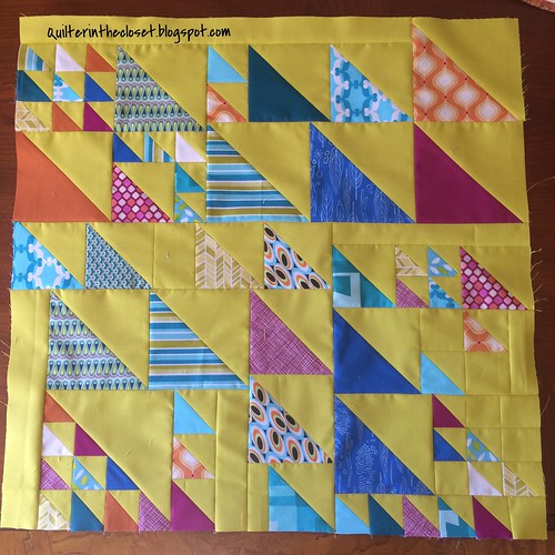
I haven't made much this week, but one thing I was able to cross off my list was this 24'' x 24'' block for the QuiltCon Charity Challenge. I joined the individual group and together we decided to make blocks with HST's of varying sizes. The challenge had a set color palette, and was supposed to highlight an alternate grid pattern. Our group chose to use the color "Wasabi" as our background and incorporate prints and solids from the other colors in the palette.
Can I just say......I really dislike "Wasabi". Knowing that there is a slim possibility that I might eat these next few words sometime in the future (after all, I have warmed to color orange a tiny bit)- I really don't ever want to use it again. It reminds me of bile. It may look like a lime green in the picture, but it is more yellow than that. Split pea colored fabric would have more appeal. This block took longer than I anticipated to put together, so I had to keep looking at that horrid color. It nearly drove me mad. I just hope that whoever gets our charity quilt in the end, doesn't feel the same way.
Do you have a color that has the same effect as nails scraping on a chalkboard for you?
What blocks have you working on? I would love to see. Link up your fabulous blocks. You put a lot of hard work into them - show them off! This free linky will stay open until the first Monday of next month, but I will repost it every Tuesday until a new month starts.

Rules:
1) Please link up only to the page in your blog showing your wonderful blocks, not just the blog homepage. Flickr pictures are also OK.
2) Make sure to put your blog name as the description so people know where they are going or the name of your block!
3) Please grab my button and post it in your blog post or sidebar.
4) Visit other linky participants!
Thanks for reading!
Jen
Hi!!!! I love your block!!!! I think the other colors make up for the wasabi!!!!!
ReplyDeleteI know exactly what you mean! Yellows and oranges are hard for me to work with--though I do like the burnt varieties okay. I've been working on the pastels quiltcon challenge and haaaaate iiiiiiiiit. Ugh pastels. Wish I hadn't signed up for it at all, at least the design is fun. Hate the pastels, gah they make me so grumpy.
ReplyDeleteYou're so funny - but I am right there with you on the wasabi color - lime green would be good! I have a hard time with yellows myself, a really hard time...
ReplyDeleteLove the block Jen, and even the Wasabi! The color really works with the orchids
ReplyDeletelove the variety of sizes here in ths block, wasbi does not bother me too much, however I am not a blue person I love orange and green
ReplyDeleteI certainly go off fabrics that I've been working with for ages! Irrespective of the colour, I'm not usually s fan of HSTs, but this is s fab collection x
ReplyDeleteWow !! What a fantastic colors you chose for this block. I love it :)
ReplyDeleteI don't really 'dislike' the background color, but I can understand how it appears overwhelming. For me, I think it is one of those colors that looks great in the grand scheme of things and you have to see beyond it. In the end, I think it will really make a statement for the entire quilt.
ReplyDelete